Gideon Weissman
Former Policy Analyst, Frontier Group
A look back at some of our favorite charts, maps and graphics from the last 25 years, and the role they played in the environmental policy conversation.

For people who work with data, there’s nothing like a great chart. A visual depiction of information can help your audience understand the issue better, and sometimes can catapult a story to much broader exposure. In this post we’re taking a look back at some of our favorite charts — and why we’re proud of them.
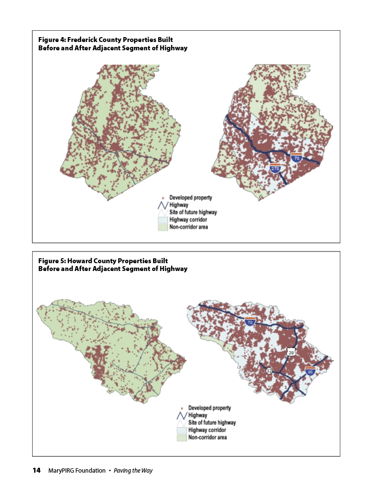
In 2000, Maryland was rapidly losing land to suburban sprawl. Each year, open spaces and farmland were being bulldozed and replaced by subdivisions linked by an ever-growing highway network, creating environmental and quality-of-life problems. As Maryland looked to tackle the problem of sprawl, policy-makers grappled with a chicken-and-egg question: Was the sprawl driving demand for new highways, or were the highways enabling the sprawl?
This map from Paving the Way helped answer that question in a way that made a complex process understandable at a glance. To make it, we combined detailed data about housing growth over time with maps of Maryland’s evolving highway network to show conclusively that it was highway construction that opened the door to new sprawling development. The research played a key role in the state’s continuing policy debates, and the chart itself was highlighted in an appearance by then-Governor Parris Glendening, who made combating sprawl a central issue for his time in office.
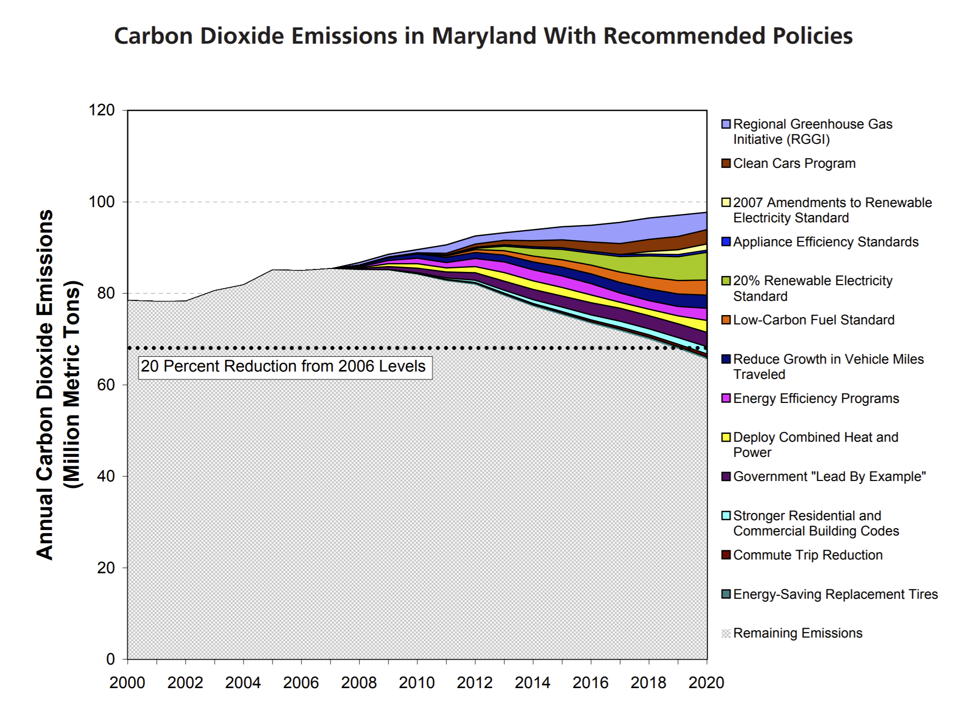
Global warming can seem overwhelming, but effective solutions are often right in front of our eyes. During the 2000s, Frontier Group produced a series of reports that laid out state-level policy frameworks for fighting climate change.
We love this chart from our 2007 Maryland report Blueprint for Action because it shows the power of policy: How key climate actions could, by tackling different sectors and different types of pollution, drive down state emissions in line with state goals. Ultimately, Maryland was able to meet and surpass its goal of cutting carbon pollution by 20 percent by 2020, thanks in part to some of the policies highlighted in the report.
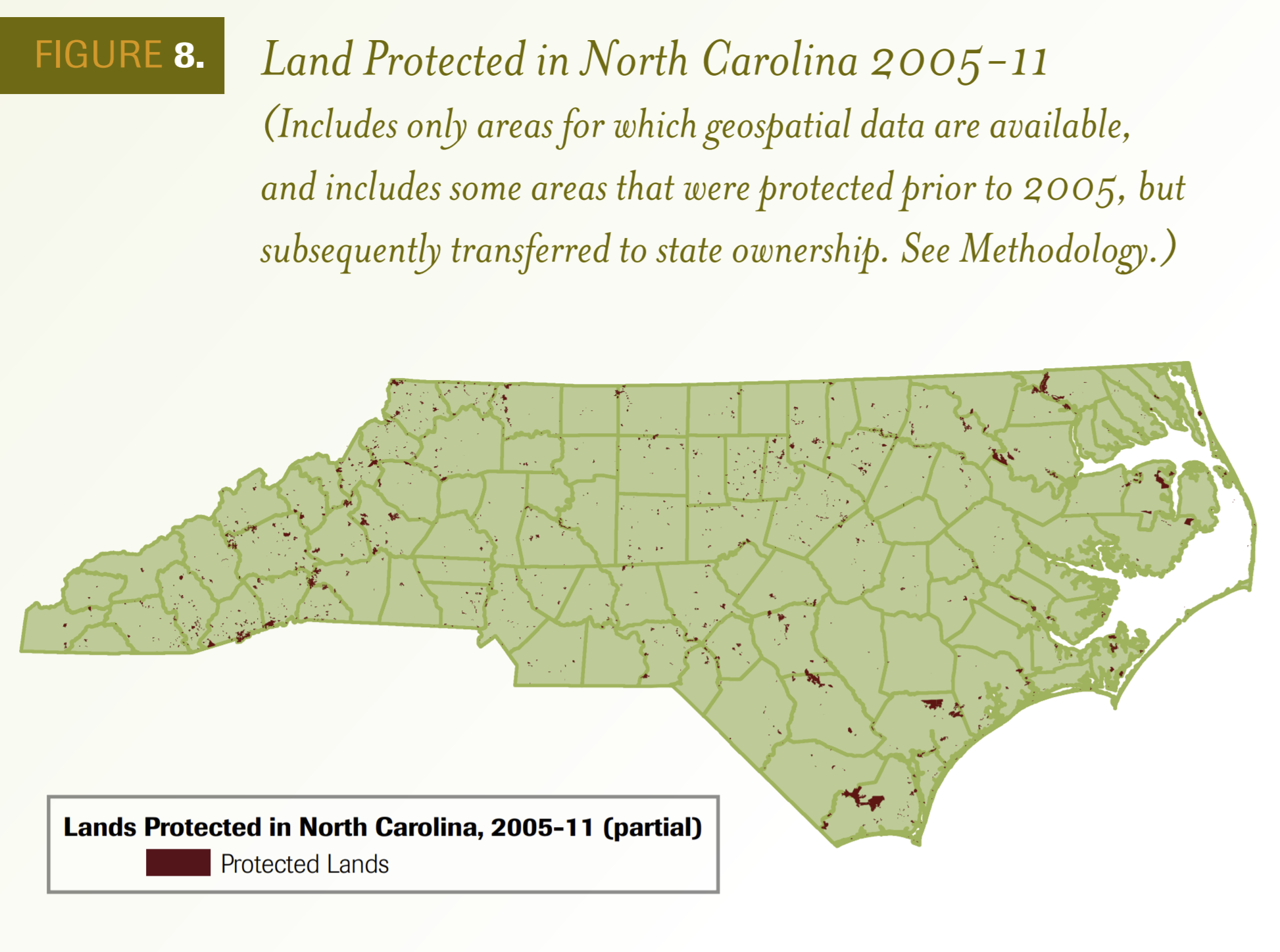
A good map can distill information from a giant array of sources into a single, memorable, understandable image. That’s the beauty of this figure from our 2012 report, Securing North Carolina’s Future, written with Land for Tomorrow, a coalition of conservation groups in North Carolina.
The map brings together data from a wide variety of local, state and federal conservation programs to show that those programs had protected large amounts of land across North Carolina, but were still falling short of the state’s overarching conservation goals. By showing the location of the 389,000 acres of land protected between 2005 and 2011, the map helped remind policy-makers and the public about the benefits of conservation and the critical importance of protecting pristine forests, ecologically important wetlands and prime agricultural land.
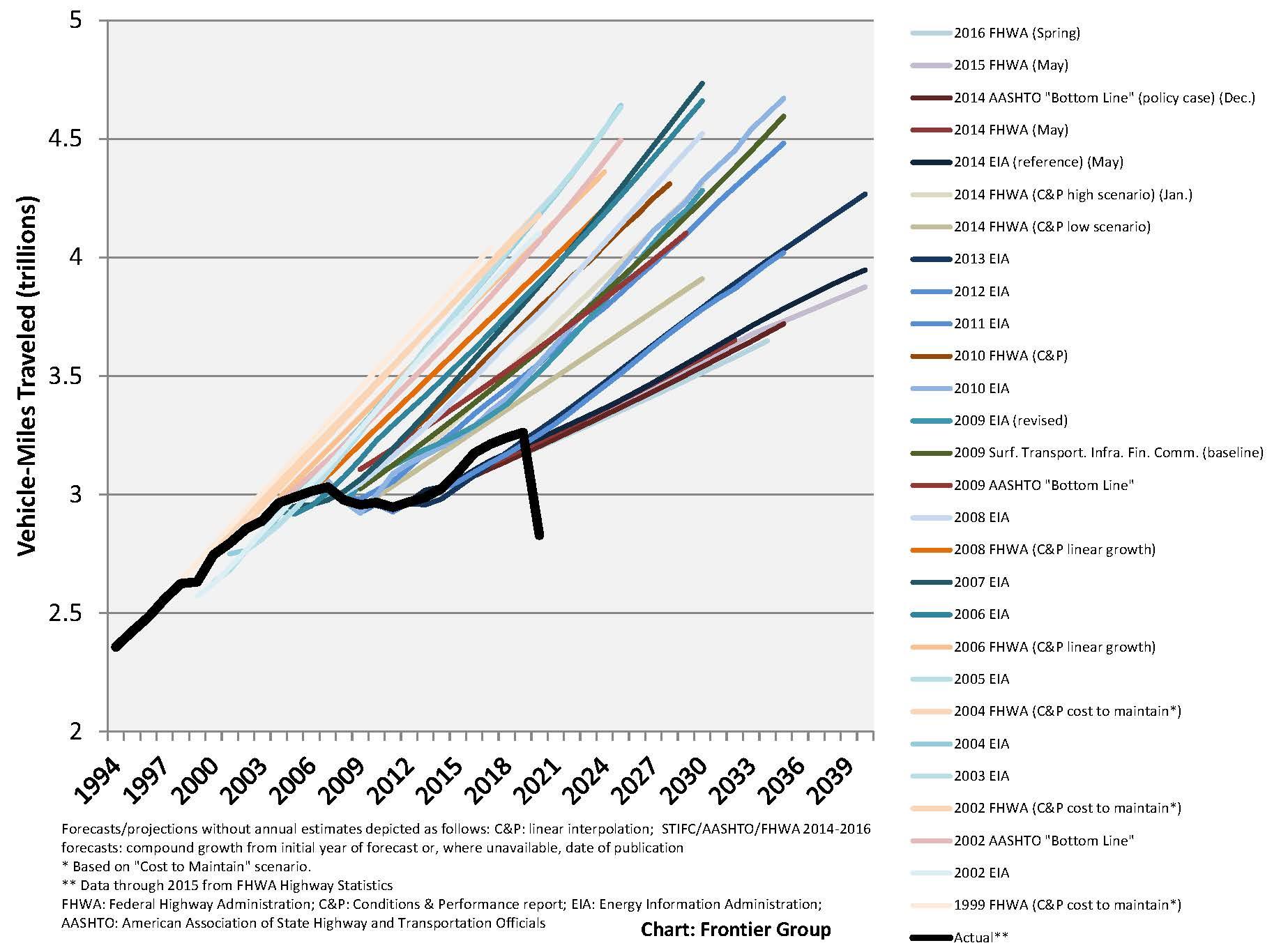
In the late 2000s, Frontier Group researchers began to notice that state and federal projections of future growth in driving bore less and less relation to reality as the years went on. While government agencies forecast rapid growth in vehicle travel, the number of miles Americans were traveling was growing only slowly, if at all. That’s a problem, because bad forecasts can lead to misspending of transportation money.
For the 2013 report, A New Direction, and for presentations around the country, Frontier Group analysts created charts like this one, comparing actual vehicle travel with official projections made by government agencies over the previous two decades. The U.S. Department of Transportation eventually adopted a new methodology for making national projections of vehicle travel. But as the severe downturn in driving during COVID-19 showed, the future has its share of surprises, and our view of the future needs to continually evolve to reflect reality.
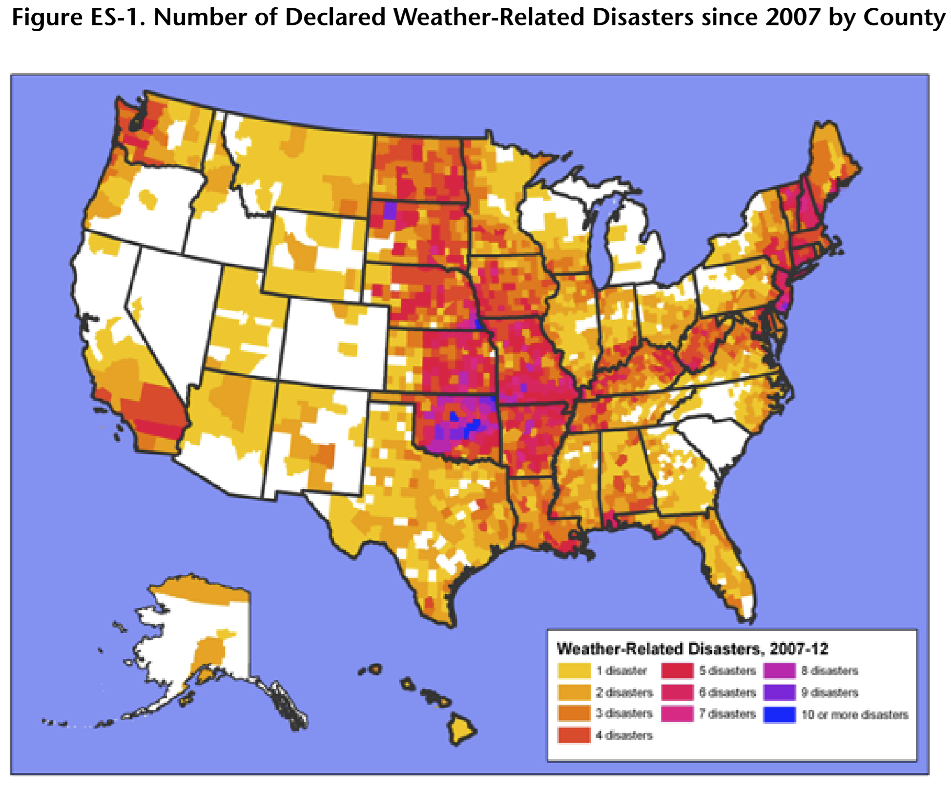
Global warming is often linked with coastal hurricanes, western wildfires and other extreme weather events associated with specific regions of the country. But climate change will leave no part of America untouched.
To illustrate the potential implications of climate change, in 2012 we released In the Path of the Storm, which reviewed the science linking climate change with extreme weather and highlighted the disruption Americans were suffering because of weather-related disasters.
These findings were made especially memorable in map form. The maps, showing a count of weather-related disasters by county, showed that flooding of the kind that could be worsened by extreme rainfall is the most widespread type of weather-related disaster in the U.S. and that some parts of the country are especially vulnerable to the effects of extreme weather. After releasing the report we started hearing from people who were experiencing these disasters firsthand, and had their own stories to share. So we worked with Environment America Research & Policy Center to build an interactive version of the map that includes submissions from the public, making the global threat of climate change feel more personal than ever.
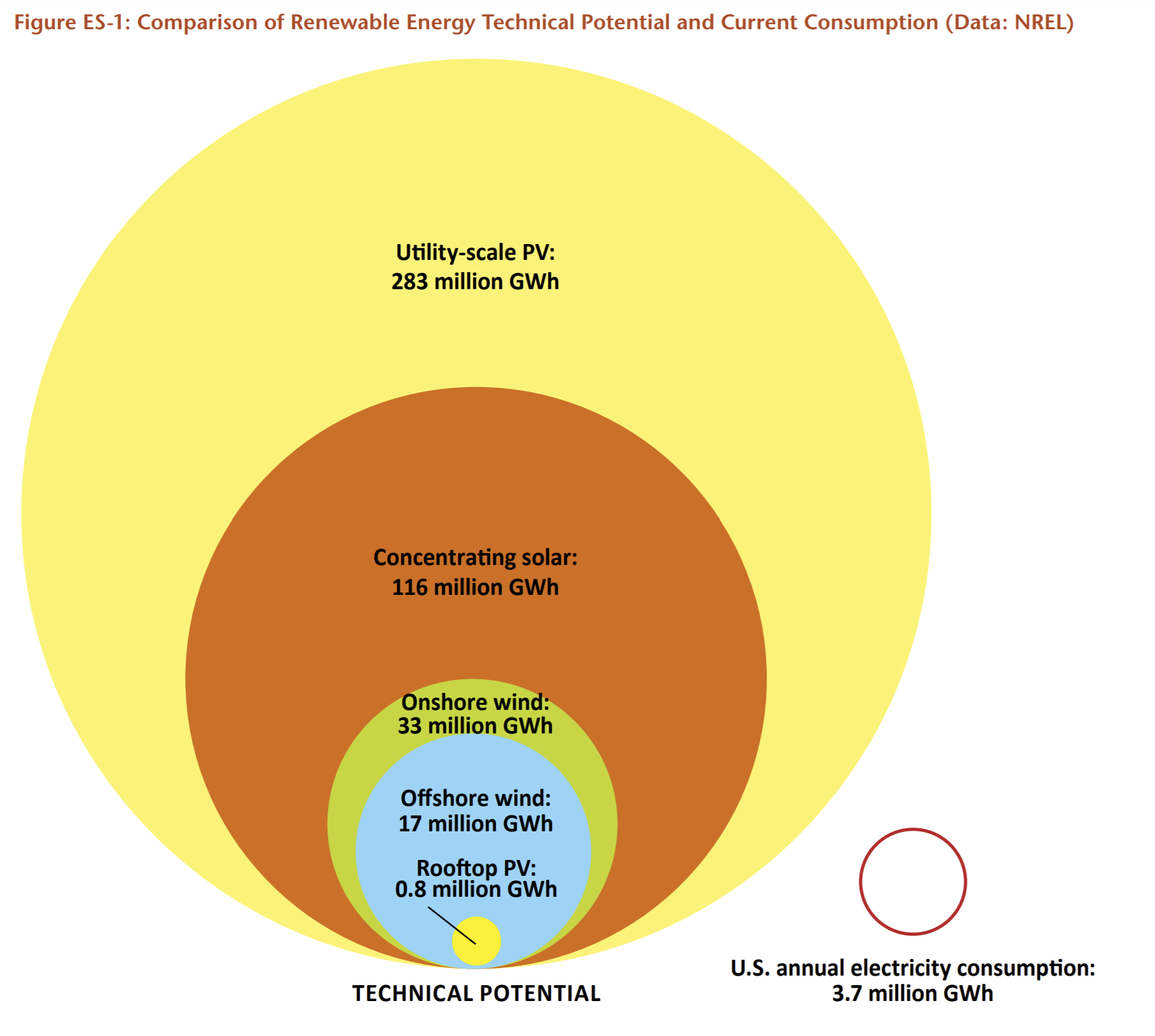
Our favorite charts are those that elevate an important story from the shadows of technical data. That’s certainly the case with our chart showing America’s technical potential for producing renewable electricity. “Technical potential” is the maximum amount of electricity an area could produce given available physical resources and technological limitations.
For the 2016 report We Have the Power, we used a dataset from the National Renewable Energy Laboratory to tell the story that America’s wind and solar resources have the potential to supply our electricity needs many, many times over. On its release, the chart was shared widely, and the news outlet Grist even devoted an entire article to it titled “This chart shows the United States’ mind-blowing clean energy potential.”
The internet’s potential for interactivity has allowed us to create charts and maps that allow users to explore data themselves in order to discover their own stories.
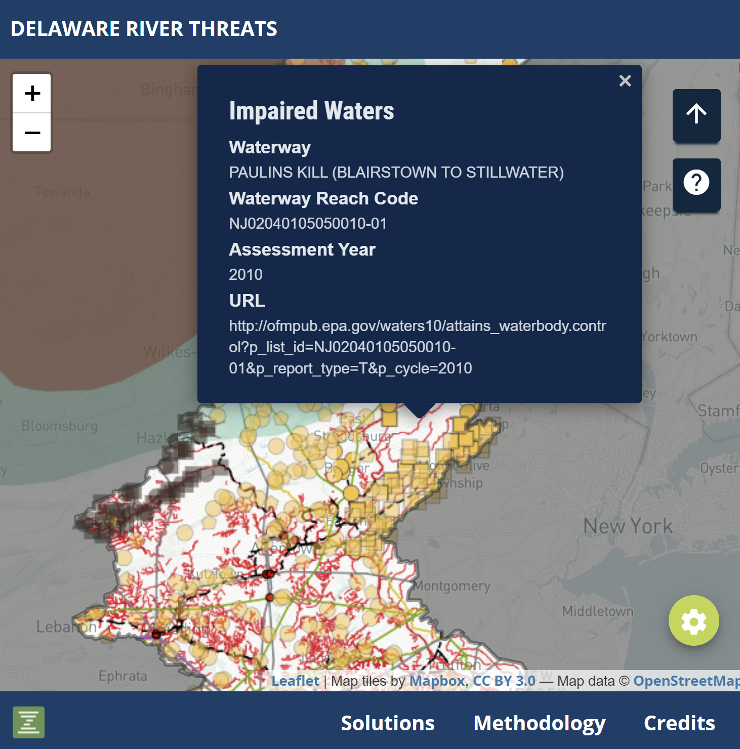
This is the case with our map of threats to the Delaware River Basin, created with Environment America Research & Policy Center. It combines information on a variety of water pollution threats — fossil fuels and mining, industrial facilities, urban and agricultural runoff, and sewage systems — and then lets users search, pan and zoom to explore how those threats might affect their own regions or communities. As we described on the map’s companion site, the point of the project is “visualizing the problems so we can solve them” — and on its release we shared the tool widely with members of the public and coalition partners throughout the Delaware River Basin.
In 2018 we released the second edition of Renewables on the Rise, a report series that calls attention to the explosive rise of clean energy technologies in the United States, including wind and solar energy and electric vehicles. It’s a report designed to get people excited about the progress we’ve made in cleaning up our energy mess and the incredible promise of a clean energy future. So, with that in mind, we built an interactive online chart that lets users track the rise of clean energy — and compare their state with their neighbors or with the nation — with clickable, animated charts. And to help more people see it, we made the chart shareable and embeddable, a feature that was put to use when Greentech Media embedded the interactive chart on their website.
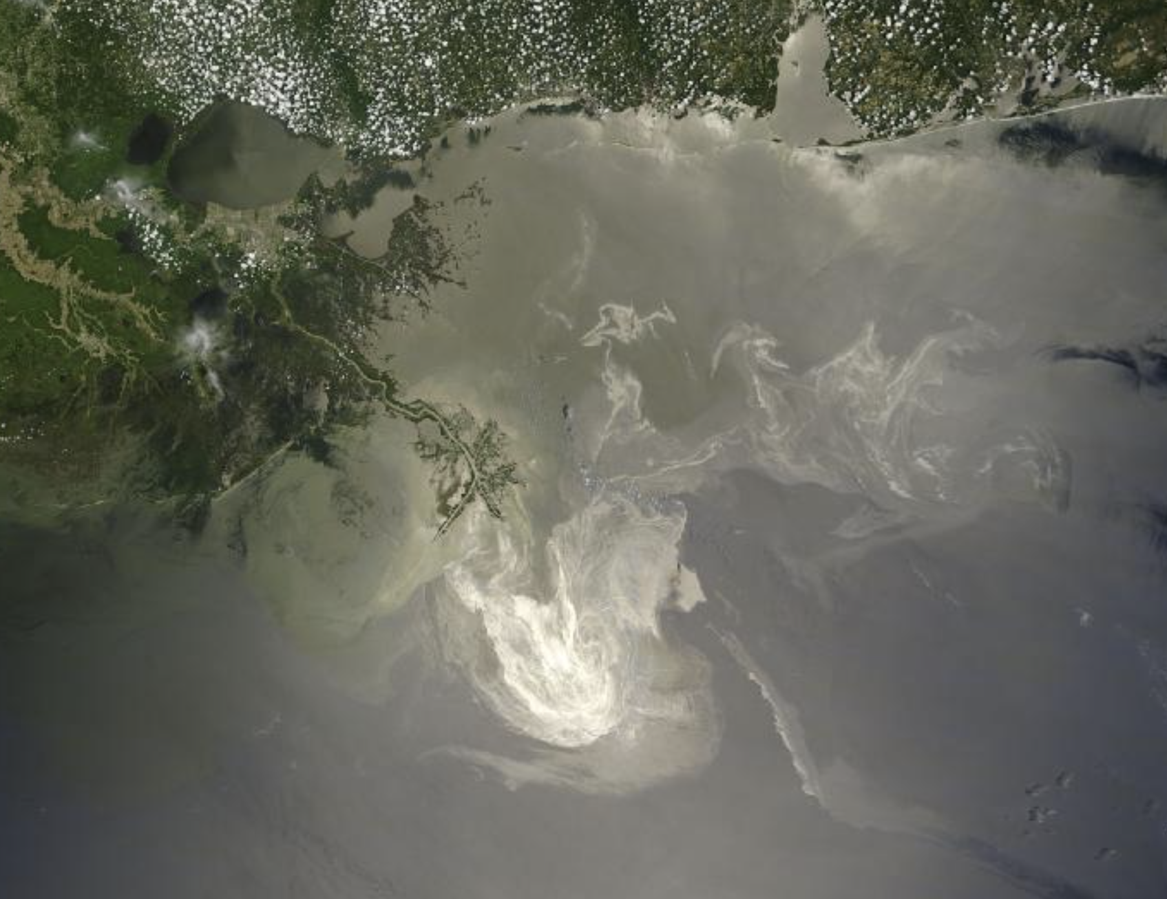
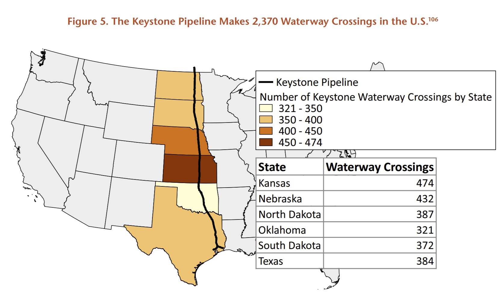
In Accidents Waiting to Happen, our report looking at catastrophic spill threats to waterways around the country, the fossil fuel industry plays a leading role. One of the biggest threats: the Keystone Pipeline, which travels north-south across the entire United States from Canada to the Gulf of Mexico. The shoddily-built pipeline has spilled hundreds of thousands of gallons of oil during its lifetime, putting waterways and people at risk.
To better understand the risk to waterways, we used data compiled by the Keystone Mapping Project to conduct an analysis of the number of river and stream crossings the Keystone makes by state. The resulting chart dramatically illustrates the threat of the Keystone pipeline to more than 2,000 waterways across the middle of the country, and was widely shared on social media.
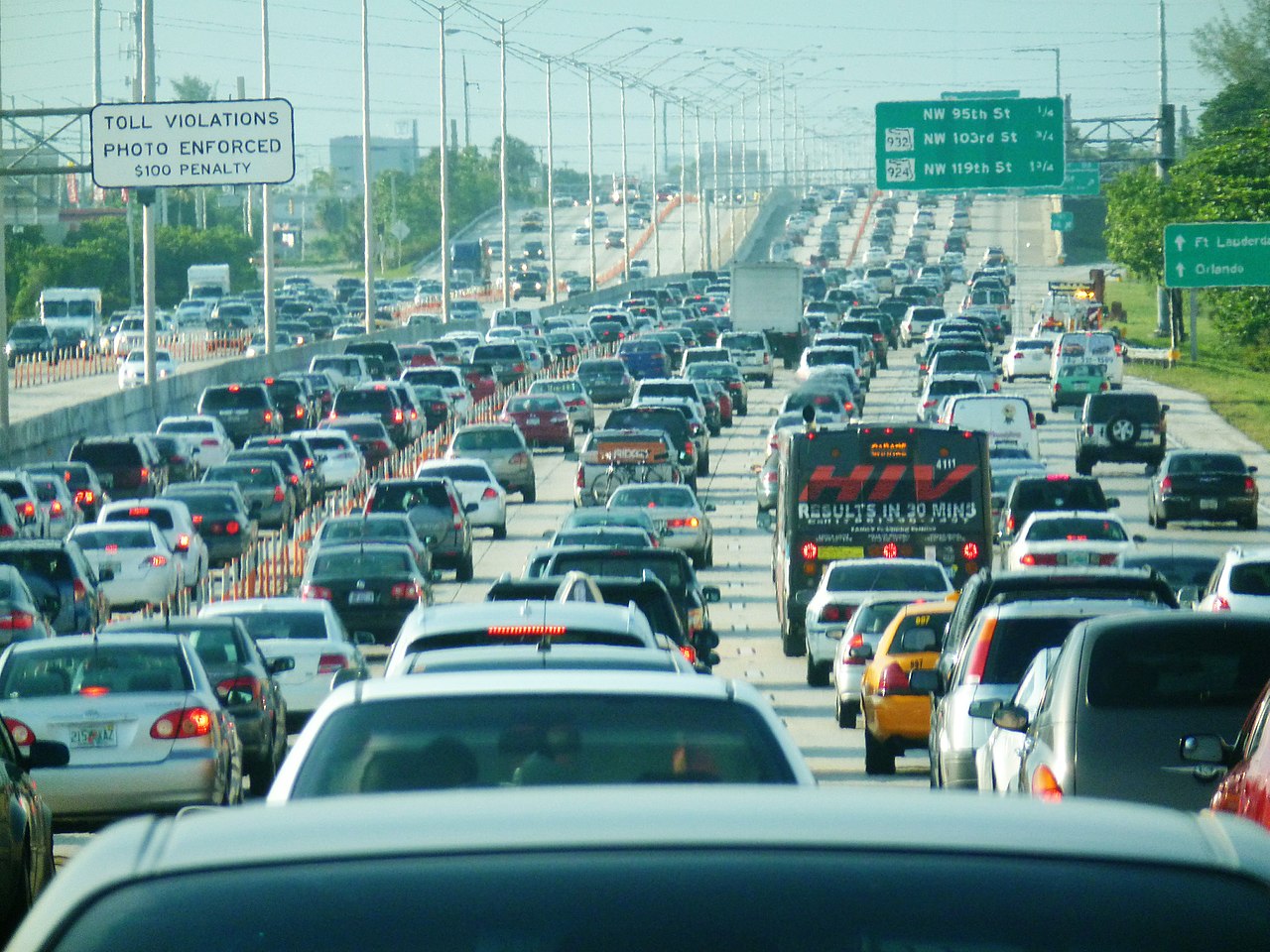
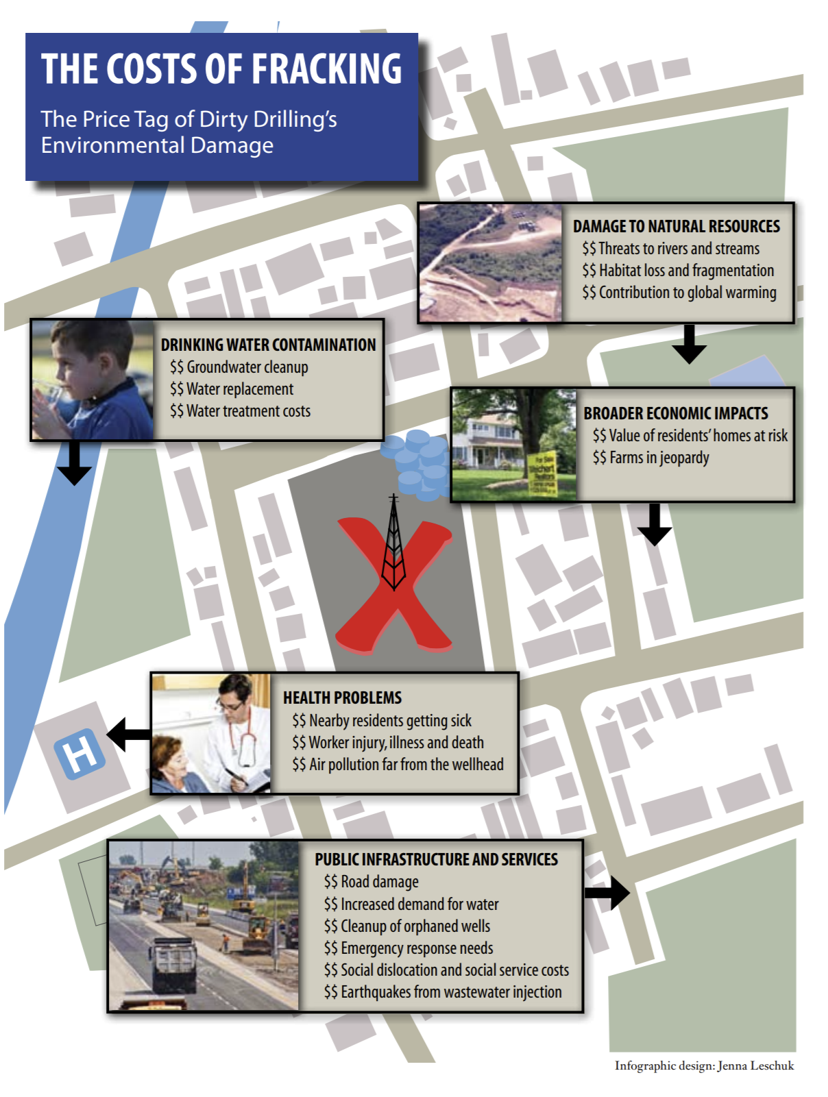
Fossil fuels create environmental damage every step of the way — from production through use — so much so that it can be difficult for the public to understand the full extent of the destruction. In 2012, as fracking was still exploding across the country, we released The Costs of Fracking: The Price Tag of Dirty Drilling’s Environmental Damage with Environment America Research & Policy Center. The report catalogued the variety of costs that oil and gas drilling impose on our communities by damaging the environment, public health and infrastructure.
The report dug into a variety of data sources to build a strong case — but it was the infographic overlaying each impact on a stylized map of a community that helped bring this data to life, allowing readers to quickly comprehend the variety of ways that fracking imposes costs on our environment, health and pocketbooks.
Former Policy Analyst, Frontier Group